Friday, March 25, 2011

Sunset Layout & Digital Stamps

What is better than watching a sunset?  How about watching a sunset in the Caribbean while there are dolphins jumping along your cruise ship.  It was such a terrific experience - I had to scrapbook it!


I used lots of different elements and techniques to make this layout.  I added color to the ivory cardstock using a sponge and glimmer mists.  The sun is a modified digital stamp by Tiffany Doodles.  If you are not familiar with digital stamps, they are digital images made to look like stamps, which you print out versus using a stamp and ink.  Did you know you can cut clean-lined digital stamps in Sure Cuts A Lot using the Trace function?  I will show you how to do this in a future post.  There are many free digital stamps available online.  In fact, there is a blog that provides links to these stamps.  Check out the Free Digital Stamps blog here.

I created the journaling in Microsoft Word and enlarged and colored the key descriptive words used (perfect, serene, sunset, and dream). 


To enhance the way we felt watching the dolphins jumping, I added a quote by Elegant Wordart by Bethany.  I printed the quote on transparency paper to make it easier to center and place on my layout.


Other materials used:
  • Glimmers Mists in Tuscan Sun and Lemon Meringue
  • Sunset title cut using Sure Cuts a Lot and my Cricut.  The font used is "akaDora" by The Scrapping Table.  I used the shadow feature to create all 3 layers of the title.
  • Rhinestones, brad, and bunched/stapled ribbon to embellish.

I am entering this layout into the following challenges:
Thanks for stopping by!  Happy Friday!

Wednesday, March 23, 2011

Spring Shadow Box is Now Displayed in My Entry Way!

I had so much fun making my Spring "Welcome" shadow box (details HERE).  I absolutely love how the tree turned out and can't wait to make other backgrounds when the seasons change.  I was so excited to hang this shadow box on the wall.  I kept asking my husband when he would hang it that I think he thinks I am crazy!  :)  Unfortunately, I didn't win the SVGCuts challenge I entered this into, but I will certainly treasure this shadow box for many years to come!


Thanks for looking!

Monday, March 21, 2011

Water Distressed Flower Tutorial by Such a Pretty Mess

I found the water distressed flower tutorial that I used to make the flowers for my "Our Family" shadow box.  See picture of one of these flowers below.  The tutorial was created by Gabrielle at Such a Pretty Mess, and it is very easy to follow.  Click here to go to the tutorial.  You will have to check out Gabrielle's other tutorials and inspirational projects while you are visiting her blog.  She is very talented!


These flowers work perfectly for shadow boxes because they are very three-dimensional.  I love, love, love the look of these flowers!  For the flower shown above, I inked the edges of the petals with glimmer mist in Tattered Leather (brown) to give it more of a vintage feel.  To attach the pins, I pushed them into a small piece of chipboard which I hid behind the flower.  By pushing the pins into chipboard, you avoid getting painful pin pricks.

I hope you enjoy making these flowers!  I certainly did!  :)

Saturday, March 19, 2011

Scan Your 12X12 Scrapbook Pages! It Is Easy and Free! Instructions Included!

I recently figured out how to scan my 12x12 scrapbook pages, so I thought I would share it with you!  It is a lot easier than I thought it would be and the best part is that it is free (assuming you have a standard-sized scanner that you can use)!  It is a great way to create back-ups of your pages, and it allows you to share your pages easily online.

Here are the Instructions:

Step 1:  Download the free Autostitch software available at autostitch.net.  Once downloaded, unzip the autostitch folder.  To unzip, right click on the autostitch folder and click Extract All.  Then browse to where you want to save it (I saved to my desktop), and click Extract.

Step 2:  Scan each of the 4 corners of your scrapbook page using your scanner (see your scanner manual for how to scan) and upload the scanned images into your photo editing software.  I use Picasa photo editing software by Google - it is free and it works great!  You can download Picasa here.


Step 3:  In your photo editing software, rotate each of the 4 corner images to clockwise.  Note: If an image isn't straight, you should straighten it in your photo editing software or rescan the image.


Step 4:  Save each image as a JPEG file (the images are usually scanned as a BMP image).  To Save, click on the image.  Go to the File menu-->Save As.  Then browse to where you want to save the image and click Save.

Step 5:  Go to the autostitch folder you saved in Step 1.  Open the folder and double click on the Autostitch software (circled in Red below).


Step 6:  Click Run


Step 7:  Go to File-->Open


Step 8:  Browse to where you saved the images in Step 4.  Select all 4 images by clicking on them while holding down the Ctrl key.  Then click Open.


Step 9:  The autostitch software will now run.  When it is finished, it will display the stitched image. 


Step 10:  Edit the image in your photo editing software if you desire.  Make sure to Save the stitched image.

Please leave a comment if this tutorial was helpful and/or if you have any questions about these instructions.  I will respond to questions as soon as I can.  Have a great day!

Wednesday, March 16, 2011

Spring "Welcome" Shadow Box

My husband and I are remodeling our entry way, so I thought it would be fun to create a welcome sign to hang up in this room.  I was inspired by the challenges going on where you need to use SVG files from SVGCuts because I absolutely love their files!  I decorated this welcome sign/shadow box for spring using mostly SVGCuts files.  I plan to switch out the background of this shadow box for each season.  One down, three more to go!


My favorite part of spring is when the Crabapple and Redbud trees blossom so I wanted to include one of these trees in my design.  I used my Cricut and Sure Cuts A Lot (SCAL) to cut the shapes for this tree as well as most of the other shapes used in this design.  I used the hydrangea flower SVG file from the Moonlight Garden Party SVG Collection at SVGCuts to create the blossoms on the tree.  The tree trunk I used is from the Camping at Fox Ridge SVG Collection at SVGCuts.

I also wanted to include rain without making it the focus of the design, so I used the scalloped corner free SVG from SVG Cuts to separate the gray/rainy part of the design.  The clouds, rain drops, and Robins are from the Robin's Return SVG Collection at SVGCuts.

Other materials used:
  • Paper - Cardstock is by Baazill and DCWV, Patterned Paper is by My Minds Eye (29th Street Market)
  • Robins - Robin's Return SVG Collection at SVGCuts, I used small black pearls for the eyes and embossed their tummies using my Swiss Dots template and my Sizzix Texture Boutique machine.
  • Tulips - free SVG file from SVGCuts
  • Butterfly Silhouette - free SVG file from SVGCuts
  • Picket Fence - a free SVG file by Penny Duncan Creations
  • Grass - from Plantin SchoolBook Cricut Cartridge
  • Font used for "Welcome" is PMingLiU-ExtB by Microsoft, I made the font thicker using the shadow function
  • I used 3D foam squares by Therm-O-Web to pop-up the Robins, grass, tree, clouds, and raindrops.  I stacked the foam squares 3 high for the "Welcome" title so it looks like it is at the front of the shadow box.
I entered this project into the Spring SVG Challenge at the SVGCuts Forum and the current challenge at the Sure Cuts A Lot Challenge Site.

Thanks for stopping by and happy crafting!

Wednesday, March 9, 2011

"Our Family" Shadow Box

I finished the shadow box I have been working on and thought I would share some pictures with you.  As many of you know, I used Sure Cuts A Lot (SCAL) to design this layout.  If you missed it, click here to see last week's post (I included instructions as well).

I am really pleased with how this shadow box turned out.  So here are some pictures.  I kept the color scheme warm and neutral so it can hang on the wall all year round.


I made the blue and yellow flowers and I absolutely love how they turned out.  I used the water distressing method (get tutorial link here) and I think I am addicted to making these flowers now!  There are so many color combinations to try!  Here is a close-up of the flowers I made.


I included a quote about love.  To make this quote, I used a free "Love" word art from Scrap Orchard and changed the color of it to yellow.  Then, I added the quote in brown text.  The font used for the quote is Blackjack available at Font Squirrel.  The quote says:  "Love knows no limit to its endurance, no end to its trust, no fading to its hope; It can outlast anything. Love stands when all else has fallen." ~Corinthians 13:7-8.  I used Tim Holtz ink in Tea Dye to give the white cardstock an aged look. 
 

Other materials used:
  • Orange paper flowers by Prima Marketing Inc., I layered them and put a yellow skittle in the center.
  • Yellow striped paper by We R Memory Keepers
  • Cardstock by Baazill
  • Lace by Stampin' Up!
  • Glimmer Mists in Tattered Leather, Blue Skies, Riptide, and Pearl to color and add shimmer to the flowers
  • I used my Cricut and SCAL to cut the flourishes by Skhedr Designs, the doily mat by Sensationally Chic Boutique, 6 petal flowers by Images by Heather M, bracket frame by Cricut Crafty Clare, and the title using the Blackjack font mentioned earlier.  All are free SVG or font files.
I am entering this project into the Sugar and Spice Challenge at Getting Cricky.  I think it has "sugar" - lots of family love, and "spice" - per the candid shots and colors used. 

My next project will be a Spring themed project.  There are lots of Spring challenges going on and I am hoping to enter a couple! 

Thanks for taking the time to look at my project!  Have a great day!
Melanie

Friday, March 4, 2011

Design Your Project in Sure Cuts A Lot! Instructions Included!

I just finished designing a new shadow box layout in Sure Cuts A Lot and wanted to share it with you.  I haven't finished this shadow box yet, this is just a sneak peek!  I will share pictures of the finished shadow box along with the materials used in a future post.  Included in this post are tips to help you design your own projects in SCAL!  


I like designing my layouts in SCAL for lots of reasons.  I love seeing what the project will look like before I cut or print anything.  This saves me from having to re-cut shapes because I didn't like the color or the size was wrong.  Also, I like that I can design anywhere I can bring my mini computer - a scrapbook retreat, coffee shop, wherever!  Once the design is complete, the process to put the project together is fast - just cut & glue! 

Here are six helpful tips when designing your layouts in SCAL.  I have included step-by-step instructions for each of the tips below. 

Tip #1
Select a large rectangle or square shape from the SCAL Shapes Library to create the background of your layout.  

Select the shape from the Shape Library by clicking on it.  In this example, I selected the horizontal rectangle.

Next, change the size of the shape to match your layout size.  Change the width and height as shown in the circled area below.  


In my example, the background is 20" wide by 10" tall.


Tip #2
Change the color of the shapes to represent the color paper you plan to use. 

To change the color of a shape, click on the colored box under Properties: Appearance (circled in Red below).

Then, select the color you want and click OK.


The shape should now be the color you selected.

Tip #3:
Add the photos you plan to use.  I add my photos to the layout for design purposes only - I use photo editing software to print my photos.  However, printing digital stamps, paper patterns, graphics, word art, etc. onto cardstock from SCAL works great!

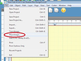
To add a photo, click on the File menu and select "Place Image."


Then browse for the photo image on your computer, select the image, and click Open.


Then, change the size of the image to the size of the photo print.

Move the picture to where you would like it placed on the layout.  I usually add all of my photos to the layout first.  Then I move the photos around (via trial and error) to determine where I like each of them placed on the layout. 

Tip #4:
Use shapes to create boxes for text, to show where paper and/or ribbon will be placed, etc. - the possibilities are endless!  In my layout, I used rectangles to display where I plan to place a quote (taupe box) and the date the photos were taken (bottom right corner).  Also, I used rectangles to represent the paper I plan to use (large brown rectangle in the background), to create my photo mats, and to represent where I will place ribbon (around the bracket frame, under the title).

Tip #5:
Use the Layer options to reflect how you would place the shapes, SVGs, and photos on the layout.  

For example, in the screen shot below the circled photo is on top of the photo adjacent to it.  I want the adjacent photo on top.

To fix the arrangement of the layers, click on the photo you want on top. 


Next, go to the Layer menu and select Arrange-->Layer to Top


The photo selected should now be displayed above the other photo.


You can also move layers to the bottom (the background should always be at the bottom), or raise/lower the layers using the Layer menu.  See all options under Layer menu-->Arrange. 


Tip #6:
Add pages to your project for individual shapes and/or SVGs to be cut on your Cricut.  This makes cutting so much easier and you can leave your designed layout intact on the first page. 

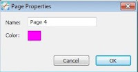
To add a new page to the project in SCAL, click on the Add Page icon circled in Red below (green plus sign, next to the Page 1 header).


You can change the Name of the page if you would like, then Click OK.


A new page should be displayed.


Go back to your design on Page 1 and Copy the shape or SVG to be cut and Paste it onto the new page you just created. 
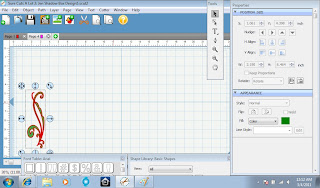


If the SVG is multi-layered, you can "Ungroup" the SVG (via the Object menu) and separate the layers to be cut individually.

I hope these tips were helpful for you and hope you try designing a layout in SCAL. 

Update:  I finished making this shadow box.  Click here to see it.
Thanks for stopping by,